Does this red hurt your eyes? Good. This type project started with this rage crawling under my skin as I was starting to finally settle as a graphic designer. I remember looking back at all my junior projects, the fonts I was using back then and thinking: thin sans serif everywhere and you haven't even actually made any of these, how could you do this? It all felt so....unexpressive. And so here comes Minotaure.
Get MinotaureMinotaure is a sans serif display font that was inspired by greek mythology: Dédale's infamous labyrinth.
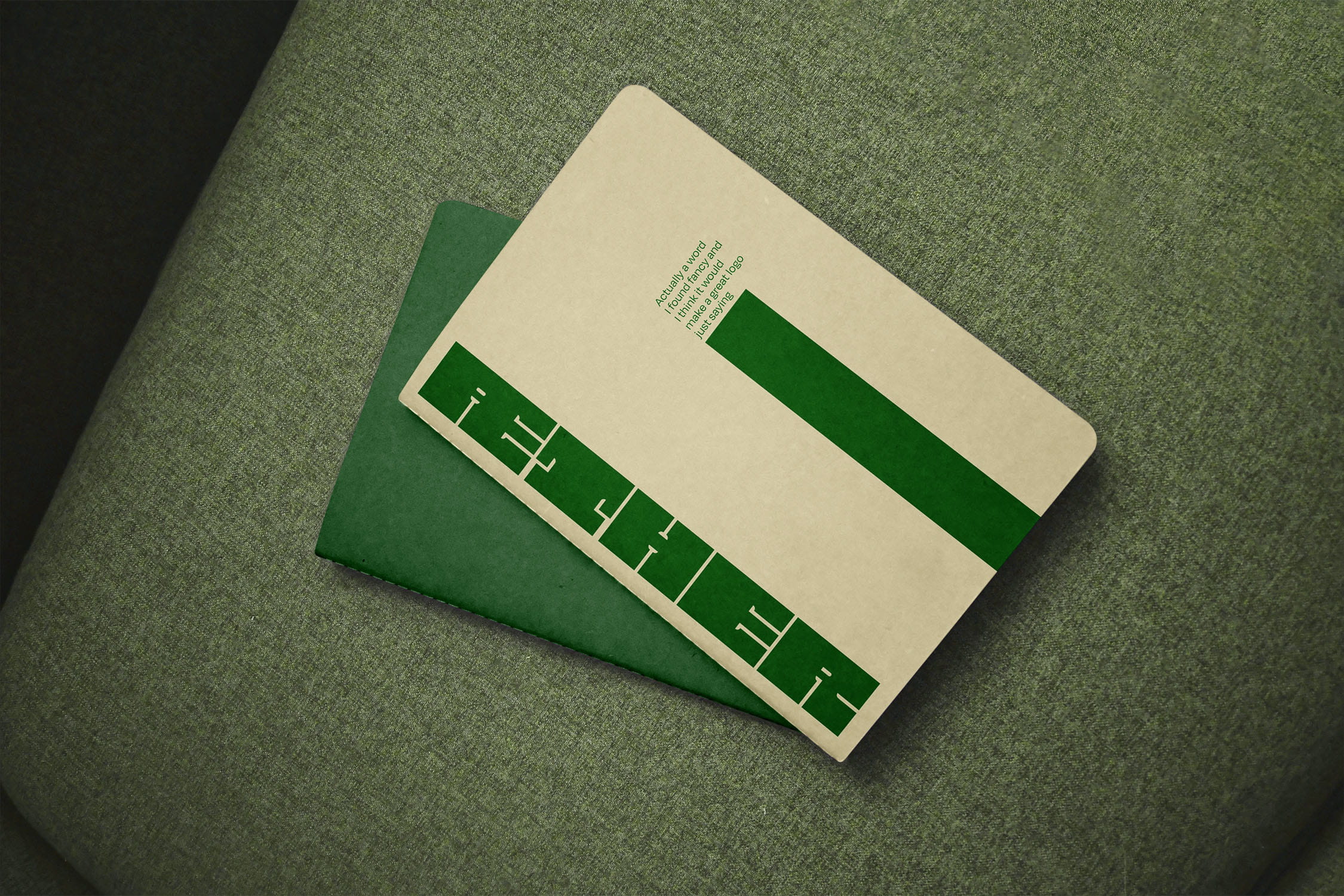
An extra bold and wide font with very small letter spacing and thin indents. It captures the essence of a maze and subtly reminds us of ancient greek pottery graphic elements.
It is sans serif, all caps and geometrical. It should not be a problem right? Ha! If only I had known...
Finding a system almost felt easy, finding ways to apply it to the different letters was the hard part. First mandatory was the exact same height for all the letters: 9 units. The counterforms have a maximum width of half a unit. Exceptions were made for letters D, J, L, P and V for readability reasons. Stems' width were individually adjusted to fit with each letter's overall positive space.